2023 Update: You can now find Maya via her new website, Poster Child.
The 24th annual Vans Warped Tour is on the path to be the best yet.
An era seemed to come to a close when Vans Warped Tour announced last year that it would travel the country for the last time in 2018. Since the announcement, the festival has set out to create the most memorable experience possible for the last run.
The finishing lineup features Warped Tour classics such as Mayday Parade, The Maine, 3OH!3 and We The Kings, amongst more recent punk favorites such as Crown the Empire, Palaye Royale and Don Broco.
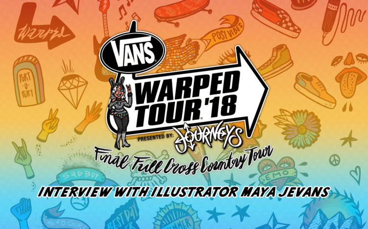
The tour took on new branding this year, with hand drawn illustrations highlighting different aspects of the iconic event.
Maya Jevans, from New Orleans, is the creative mastermind behind the new illustrations. Warped Tour was just one new addition to her roster of many festival branding packages including BUKU Music + Art Project and Okeechobee Music & Arts Festival, as well as album packages for recording artists such as Sweet Crude and Trippy Turtle. Update: You can now find Maya via her new website, Poster Child.
The iconic Warped Tour logo has remained, building illustrations around it and the events happening within the festival. Every detail is included from the inflatable schedule, the Monster mutant stages, merch tents.. You can even see Kevin Lyman riding around on his bike.
For OG Warped fans, the illustrations will bring back memories of early Warped days and the progress it’s made in paving a way for punk music.
For newer Warped fans and first-time attendees, the bright designs promise a cheerful day of heavy music and lasting memories.
We got to speak personally with Maya Jevans ahead of the tour’s kick-off about her creative process, her inspiration for Warped and how she became one of music’s most sought-after illustrators.
Maya Jevans
How did you get started illustrating and designing for music festivals?
“My mother was an illustrator/designer and she raised me to play with markers instead of dolls and to make mosaics instead of watch TV.
Growing up in California my friends and family expected that I would become an artist someday, which made me want to pursue absolutely anything else. Shortly after I moved to New Orleans for university I saw a festival lineup poster for the first time and was immediately struck by the possibility of a life spent making art for music. That was the day I proved everyone right.
My first draw-for-music projects were illustrations for Grandmaster Flash and an illustrated poster for Mardi Gras Indian Big Chief Bo Dollis when I was 19 and 20 years old, totally unaware of the cultural significance of both figures. From 2015-2018 I worked with BUKU Music + Art Project alongside my wonderful friend and collaborator, the amazing Young&Sick. In fall of 2017 I got linked up to design for Okeechobee festival in Florida, and Warped Tour reached out to commission me to brand their 24th and final run.”
What is a festival brand and why is it important?
“Music festivals are more prevalent and homogenized than ever, during the high season you can find at least one major festival every weekend and they have increasingly identical lineups due to corporate ownership by mega entertainment companies. To survive and compete a festival has to stand out with a uniquely recognizable identity that will visually represent the event’s signature look, feel, and sound to prospective attendees.
I love to see a visual brand broken out on-site through installations, special performers, and stage designs, it creates a truly immersive and multi-dimensional space. I also love festivals that refresh their brand style every year, it makes each edition really distinct so that every poster and merch piece becomes that much more commemorative. Analyzing festival brands is so fascinating because it reveals a lot about which visual trends and styles pair best with particular genres, and how music and art resonate across a demographic spectrum. I am a raging dork for this stuff.”
What did your brand for Warped Tour entail?
“I provided WT with a package that included: fonts, colors, borders and accents, icon bank, social media buttons, patterns, supplemental illustrations, and an illustrated lineup poster. I delivered this to their design and marketing team to inform the style for all communications and collateral across the 2018 season, including digital and print ads, merch, website, and more. It’s been so cool and pretty surreal seeing it all unfold, I’m loving the way the style has been interpreted and applied in so many beautiful and creative ways. Warped painted a mural in LA-based off of the lineup poster which totally blew my socks off, and I just saw something about a guitar skinned by Monster Energy with some of the illustrations. I can’t wait to see what else gets cooked up!”
Icons and Borders by Maya Jevans
Where did you draw inspiration from?
“Research, research, research. My work was really cut out for me on this project! For the first time, I was branding an event I had never experienced, played by bands I had never listened to, attended by a niche demographic that I knew nothing about. I spent more time on research than I did on ideation and execution… trying to capture the spirit and sound of something totally unknown to me. My point of contact with the festival, marketer Steph Mirski, was a star and provided links to documentaries, created photo mood boards, and listed keywords and iconic elements to be inspired by. Even so, I passed countless hours on Youtube watching university lectures and TEDTalks by WT founder Kevin Lyman, recap videos, live band recordings, and even “Warped Tour Ready” makeup/fashion tutorials by teen fans. I sourced personal stories and photos from my friends who had attended, scoured Spotify for relevant playlists, and studied all of the past WT lineup posters I could find.”
“WT had informed me that this would be the last run but the cultural significance of that didn’t sink in until they made the public announcement a month or so later. Suddenly the internet exploded with reactions from media, fans, and artists… my newsfeed was choked up for a week afterward and it felt like all 2 million followers of the WT Facebook page had something to say. Seeing that overwhelming public response inspired me to expand beyond capturing the festival’s look and feel, to pay homage to its 24-year history and impressive social impact. I learned that WT rewards fans who contribute to the Red Cross blood drive and Feed Our Children NOW! the initiative encourages generational bonding through music by offering free tickets to parents of fans under 16, spreads awareness about self-harm reduction via initiatives like To Write Love on Her Arms, and has served as a launch pad for numerous emerging brands and bands. I heard one touching account in particular of a van full of broke teenagers who followed the tour around one summer unsuccessfully slinging mixtapes until Kevin caught wind and granted them an opportunity to play on stage. I listened to teenage fans talk about how WT provided them with a crucial community of support and catharsis without which they may have turned to self harm, drugs, or violence. These fan stories more than anything were my inspiration. I know my limitations and that it would have been silly to take a shot at creating the world’s coolest hippest best-drawn festival brand. But I thought maybe I could aspire to craft the most considered and thoughtful brand. I was staggered by the impact and legacy of this entertainment giant, and my one true goal was to send it off with an artistic identity that paid respects to all that Warped has done and what it has meant to so many people.”
What are some underlying themes and messages of the branding?
Sunset: “We ran with a sunset theme since WT is a day-to-evening event and because this final run would serve as a ‘sunset’ of sorts for the life of the tour. The principal colors I selected were derived from the hues and gradients of a sunset, and the sun is worked into many of the illustrations.”
Inclusivity: “I included some variable brown/neutral tones in the color palette so I could represent a spectrum of skin tones, which I also often abstracted into rainbow-y gradients. The lineup poster features a bird’s eye view illustration of the festival crowd; in it, I hoped to portray a diverse array of body types, ages, and races, all united by music and revelry.”
VANS: “VANS shoe brand sponsors Warped so I created a handmade quirky version of their signature checker pattern to use heavily throughout all assets and worked in a lot of skater imagery. For a while a pair of my roommate’s VANS shoes were living on my desk, posing as my models.”
Tattoos: “I noticed that tattoos are extremely popular with WT artists and attendees, so that became a major visual theme. There are tiny tattoos drawn onto all of the little characters, icons based on traditional tattoo symbology, and an illustration of tatted arms that combines Sailor Jerry iconography with Warped-specific references.
I tried to allude to all of these themes as much as possible in every asset, spend some time looking closely and you’ll find a lot of minute references, jokes, and easter eggs! The lineup poster especially is crammed full of intentional intricacy and every detail is inspired by all that exhaustive research.”
Can you describe your illustration process?
“Everything is a marriage of analog and digital. I start by sketching with pencil and after 2-3 rounds of refinement, I do the linework piece by piece with all manner of ink pens, pencils, and brushes on paper. I scan those into Photoshop, assemble the pieces into a composition, and paint in the colors digitally. It’s a pretty laborious process and my files are hundreds of layers deep but I love to see the human hand evident, it lends a special whimsy and richer textures.”
Did you find a new favorite band while working on this project?
“Absolutely! I really connected with Neck Deep, who happen to have numerous albums with covers done by one of my favorite illustrators, Ricardo Cavolo. On a larger scale, this was my first immersion into pop-punk, emo, and metal, which gave new context to so much of the cultural fabric of my generation. I figured out where the line “No one likes you when you’re 23” came from just in time for my 23rd birthday. There were all these songs that would come on the jukebox and make a bar erupt into a sing-along, finally, I know them to be pop-punk and I can sing along too! It was really illuminating to hear fans, especially troubled teens, speak about the emotional catharsis these styles of music afforded them and how Warped Tour was the only place to experience it en masse. That’s when things finally clicked and I started forming genuine connections with what I was hearing. I got to see emo live for the first time this spring when BUKU branched out and booked A Day to Remember, it ended up being one of the most lively and energetic crowds I have ever seen.”
Has this opened the door to any new offshoot projects? What’s next for you?
“I did hand-painted illustrations for a Journeys x VANS magazine cover that just came out this June in conjunction with Warped Tour, which you can find at all of their nearly 900 US store locations. I painted up a pair of custom women’s VANS high tops that are currently for sale at Foster in Metairie. I also have a painting based on the band Paramore in the VANS 45 charity art show, which will be on display: June 16 – Santa Monica, June 22 – Chicago, June 30 – Philadelphia, July 19 – Manhattan. I’ll be at the Chicago date and then I’m going on tour with Warped, riding the buses for the Phoenix, Salt Lake, Vegas, and Denver dates.”
To see more from the Warped Tour brand, keep up with art releases, and follow adventures, check out Maya Jevan’s website and instagram @mayajanejevans and @vanswarpedtour.
Let us know who you’re most excited to see at your final Warped Tour! Hope to see y’all out there!
2023 Update: You can now find Maya via her new website, Poster Child.
The 24th annual Vans Warped Tour is on the path to be the best yet.
An era seemed to come to a close when Vans Warped Tour announced last year that it would travel the country for the last time in 2018. Since the announcement, the festival has set out to create the most memorable experience possible for the last run.
The finishing lineup features Warped Tour classics such as Mayday Parade, The Maine, 3OH!3 and We The Kings, amongst more recent punk favorites such as Crown the Empire, Palaye Royale and Don Broco.
The tour took on new branding this year, with hand drawn illustrations highlighting different aspects of the iconic event.
Maya Jevans, from New Orleans, is the creative mastermind behind the new illustrations. Warped Tour was just one new addition to her roster of many festival branding packages including BUKU Music + Art Project and Okeechobee Music & Arts Festival, as well as album packages for recording artists such as Sweet Crude and Trippy Turtle. Update: You can now find Maya via her new website, Poster Child.
The iconic Warped Tour logo has remained, building illustrations around it and the events happening within the festival. Every detail is included from the inflatable schedule, the Monster mutant stages, merch tents.. You can even see Kevin Lyman riding around on his bike.
For OG Warped fans, the illustrations will bring back memories of early Warped days and the progress it’s made in paving a way for punk music.
For newer Warped fans and first-time attendees, the bright designs promise a cheerful day of heavy music and lasting memories.
We got to speak personally with Maya Jevans ahead of the tour’s kick-off about her creative process, her inspiration for Warped and how she became one of music’s most sought-after illustrators.
How did you get started illustrating and designing for music festivals?
“My mother was an illustrator/designer and she raised me to play with markers instead of dolls and to make mosaics instead of watch TV.
Growing up in California my friends and family expected that I would become an artist someday, which made me want to pursue absolutely anything else. Shortly after I moved to New Orleans for university I saw a festival lineup poster for the first time and was immediately struck by the possibility of a life spent making art for music. That was the day I proved everyone right.
My first draw-for-music projects were illustrations for Grandmaster Flash and an illustrated poster for Mardi Gras Indian Big Chief Bo Dollis when I was 19 and 20 years old, totally unaware of the cultural significance of both figures. From 2015-2018 I worked with BUKU Music + Art Project alongside my wonderful friend and collaborator, the amazing Young&Sick. In fall of 2017 I got linked up to design for Okeechobee festival in Florida, and Warped Tour reached out to commission me to brand their 24th and final run.”
What is a festival brand and why is it important?
“Music festivals are more prevalent and homogenized than ever, during the high season you can find at least one major festival every weekend and they have increasingly identical lineups due to corporate ownership by mega entertainment companies. To survive and compete a festival has to stand out with a uniquely recognizable identity that will visually represent the event’s signature look, feel, and sound to prospective attendees.
I love to see a visual brand broken out on-site through installations, special performers, and stage designs, it creates a truly immersive and multi-dimensional space. I also love festivals that refresh their brand style every year, it makes each edition really distinct so that every poster and merch piece becomes that much more commemorative. Analyzing festival brands is so fascinating because it reveals a lot about which visual trends and styles pair best with particular genres, and how music and art resonate across a demographic spectrum. I am a raging dork for this stuff.”
What did your brand for Warped Tour entail?
“I provided WT with a package that included: fonts, colors, borders and accents, icon bank, social media buttons, patterns, supplemental illustrations, and an illustrated lineup poster. I delivered this to their design and marketing team to inform the style for all communications and collateral across the 2018 season, including digital and print ads, merch, website, and more. It’s been so cool and pretty surreal seeing it all unfold, I’m loving the way the style has been interpreted and applied in so many beautiful and creative ways. Warped painted a mural in LA-based off of the lineup poster which totally blew my socks off, and I just saw something about a guitar skinned by Monster Energy with some of the illustrations. I can’t wait to see what else gets cooked up!”
Where did you draw inspiration from?
“Research, research, research. My work was really cut out for me on this project! For the first time, I was branding an event I had never experienced, played by bands I had never listened to, attended by a niche demographic that I knew nothing about. I spent more time on research than I did on ideation and execution… trying to capture the spirit and sound of something totally unknown to me. My point of contact with the festival, marketer Steph Mirski, was a star and provided links to documentaries, created photo mood boards, and listed keywords and iconic elements to be inspired by. Even so, I passed countless hours on Youtube watching university lectures and TEDTalks by WT founder Kevin Lyman, recap videos, live band recordings, and even “Warped Tour Ready” makeup/fashion tutorials by teen fans. I sourced personal stories and photos from my friends who had attended, scoured Spotify for relevant playlists, and studied all of the past WT lineup posters I could find.”
“WT had informed me that this would be the last run but the cultural significance of that didn’t sink in until they made the public announcement a month or so later. Suddenly the internet exploded with reactions from media, fans, and artists… my newsfeed was choked up for a week afterward and it felt like all 2 million followers of the WT Facebook page had something to say. Seeing that overwhelming public response inspired me to expand beyond capturing the festival’s look and feel, to pay homage to its 24-year history and impressive social impact. I learned that WT rewards fans who contribute to the Red Cross blood drive and Feed Our Children NOW! the initiative encourages generational bonding through music by offering free tickets to parents of fans under 16, spreads awareness about self-harm reduction via initiatives like To Write Love on Her Arms, and has served as a launch pad for numerous emerging brands and bands. I heard one touching account in particular of a van full of broke teenagers who followed the tour around one summer unsuccessfully slinging mixtapes until Kevin caught wind and granted them an opportunity to play on stage. I listened to teenage fans talk about how WT provided them with a crucial community of support and catharsis without which they may have turned to self harm, drugs, or violence. These fan stories more than anything were my inspiration. I know my limitations and that it would have been silly to take a shot at creating the world’s coolest hippest best-drawn festival brand. But I thought maybe I could aspire to craft the most considered and thoughtful brand. I was staggered by the impact and legacy of this entertainment giant, and my one true goal was to send it off with an artistic identity that paid respects to all that Warped has done and what it has meant to so many people.”
What are some underlying themes and messages of the branding?
Sunset: “We ran with a sunset theme since WT is a day-to-evening event and because this final run would serve as a ‘sunset’ of sorts for the life of the tour. The principal colors I selected were derived from the hues and gradients of a sunset, and the sun is worked into many of the illustrations.”
Inclusivity: “I included some variable brown/neutral tones in the color palette so I could represent a spectrum of skin tones, which I also often abstracted into rainbow-y gradients. The lineup poster features a bird’s eye view illustration of the festival crowd; in it, I hoped to portray a diverse array of body types, ages, and races, all united by music and revelry.”
VANS: “VANS shoe brand sponsors Warped so I created a handmade quirky version of their signature checker pattern to use heavily throughout all assets and worked in a lot of skater imagery. For a while a pair of my roommate’s VANS shoes were living on my desk, posing as my models.”
Tattoos: “I noticed that tattoos are extremely popular with WT artists and attendees, so that became a major visual theme. There are tiny tattoos drawn onto all of the little characters, icons based on traditional tattoo symbology, and an illustration of tatted arms that combines Sailor Jerry iconography with Warped-specific references.
I tried to allude to all of these themes as much as possible in every asset, spend some time looking closely and you’ll find a lot of minute references, jokes, and easter eggs! The lineup poster especially is crammed full of intentional intricacy and every detail is inspired by all that exhaustive research.”
Can you describe your illustration process?
“Everything is a marriage of analog and digital. I start by sketching with pencil and after 2-3 rounds of refinement, I do the linework piece by piece with all manner of ink pens, pencils, and brushes on paper. I scan those into Photoshop, assemble the pieces into a composition, and paint in the colors digitally. It’s a pretty laborious process and my files are hundreds of layers deep but I love to see the human hand evident, it lends a special whimsy and richer textures.”
Did you find a new favorite band while working on this project?
“Absolutely! I really connected with Neck Deep, who happen to have numerous albums with covers done by one of my favorite illustrators, Ricardo Cavolo. On a larger scale, this was my first immersion into pop-punk, emo, and metal, which gave new context to so much of the cultural fabric of my generation. I figured out where the line “No one likes you when you’re 23” came from just in time for my 23rd birthday. There were all these songs that would come on the jukebox and make a bar erupt into a sing-along, finally, I know them to be pop-punk and I can sing along too! It was really illuminating to hear fans, especially troubled teens, speak about the emotional catharsis these styles of music afforded them and how Warped Tour was the only place to experience it en masse. That’s when things finally clicked and I started forming genuine connections with what I was hearing. I got to see emo live for the first time this spring when BUKU branched out and booked A Day to Remember, it ended up being one of the most lively and energetic crowds I have ever seen.”
Has this opened the door to any new offshoot projects? What’s next for you?
“I did hand-painted illustrations for a Journeys x VANS magazine cover that just came out this June in conjunction with Warped Tour, which you can find at all of their nearly 900 US store locations. I painted up a pair of custom women’s VANS high tops that are currently for sale at Foster in Metairie. I also have a painting based on the band Paramore in the VANS 45 charity art show, which will be on display: June 16 – Santa Monica, June 22 – Chicago, June 30 – Philadelphia, July 19 – Manhattan. I’ll be at the Chicago date and then I’m going on tour with Warped, riding the buses for the Phoenix, Salt Lake, Vegas, and Denver dates.”
To see more from the Warped Tour brand, keep up with art releases, and follow adventures, check out Maya Jevan’s website and instagram @mayajanejevans and @vanswarpedtour.
Let us know who you’re most excited to see at your final Warped Tour! Hope to see y’all out there!
Related Content: