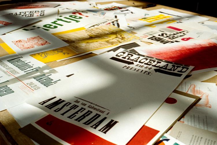
These days, small businesses and entrepreneurs can leverage tools like https://create.vista.com/create/flyers/ as a free flyer maker to create polished online and printed flyers. Yet, creating an effective design is much more than a simple exercise in graphic design. It involves understanding your target audience, the message you want to convey, and the specific nuances of the industry you’re targeting.
In this guide, we’ll delve into the art of creating compelling flyers for different industries. We’ll explain three things that matter the most in flyer design and explore some tips to keep in mind to make your designs industry-focused.
Essential Elements of Flyer Design
Flyer design is an art form that combines various elements in a harmonious and impactful manner. The components that form the foundation of any successful flyer are:
1. Color
Color plays a pivotal role in any design. It sets the mood, grabs attention, and communicates emotions subtly yet powerfully. For instance, red can incite feelings of passion or urgency, while blue can instill a sense of calm and trust. When choosing colors, consider their psychological effects and ensure they align with your brand identity and the industry you’re targeting.
2. Typography
Typography is the voice of your flyer. It not only delivers information but also sets the tone of your message. The fonts you choose should be easily readable and resonate with the personality of your brand or event. Balance larger, decorative fonts for headings with simpler, smaller fonts for detailed information.
3. Imagery
Images have the power to communicate complex messages quickly and efficiently. They can tell a story, evoke emotions, or simply grab attention. Use high-quality, relevant images that complement your content and resonate with your audience. Remember, it’s better to use fewer, more impactful images than crowding your flyer with numerous, less-effective ones.
Industry-Specific Flyer Design
Different industries call for different design approaches. Let’s take a look at how to tailor your flyer design to suit specific industries:
Restaurant Flyers
When it comes to restaurant flyers, the key is to make your audience’s mouth water. Use high-quality images of your dishes that are so good, they can almost smell and taste it. Colors play a crucial role here too. Warm, appetizing colors like reds, oranges, and yellows can stimulate hunger and draw people in.
Ensure you include essential details like your location, operating hours, and contact information. If you’re promoting a special offer or a new dish, highlight it prominently.
Example: A successful restaurant flyer might showcase a tantalizing image of their signature dish in vibrant, enticing colors, with the restaurant’s logo, location, and contact details prominently displayed.
Real Estate Flyers
Real estate flyers need to exude professionalism and reliability. They should highlight key property features in a clear and concise manner. High-quality pictures of the property, inside and out, can create a strong visual impact. Use professional, clean fonts to maintain a sophisticated look and feel. Opt for neutral or earth-toned colors that reflect stability and trust.
Example: A successful real estate flyer might feature a stunning image of a property, accompanied by a brief description, key features, price, and the agent’s contact information.
Fitness Flyers
Fitness flyers should brim with energy and motivation. Use bold, dynamic images of people working out, preferably in your facility. Strong, clear fonts can convey strength and determination. Bright, energetic colors like red, orange, or electric blue can stimulate excitement and enthusiasm.
Don’t forget to include class schedules, membership details, and any special offers you might have.
Example: A successful fitness flyer might showcase an image of people energetically working out, motivational taglines, class schedules, and membership details.
Events Flyers
Event flyers need to stir excitement and anticipation. Use vibrant colors and engaging images that capture the essence of the event. Be it a music concert, a food festival, or a charity run, make sure your flyer reflects its spirit.
Crucial details like date, time, venue, ticket prices, and how to purchase tickets should be clearly stated.
Example: A successful event flyer might feature eye-catching images related to the event’s theme, a catchy headline, the event’s schedule, and a clear call-to-action button for ticket purchases.
To sum up, the best flyers are those that manage to communicate their message effectively while maintaining consistency with their brand identity. Always keep your audience in mind, and remember, creativity is your best tool!
Related Content: